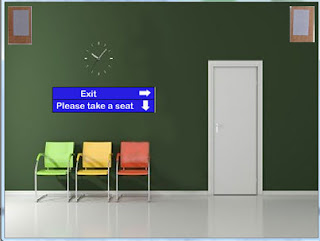
‘I think maybe that some of the graphics can be a little clearer, especially the waiting chairs in the waiting room at the beginning’ was the first amendment I was giving. By making this amendment, it makes the product look more professional as images are sharper and doesn’t look pixelated or messy. Also by making the chairs in the waiting room clearer, it makes it look more lifelike.
‘The page at the very beginning of the product gives the audience a glimpse of the course name, etc. I think that it could possibly stay on the screen for longer as it is a little quick and the audience may not see it before it disappears’. This was the next amendment that was suggested. To do this I changed the tempo or the frame and made it wait for 4 seconds. By doing this, it allows people to clearly see the title of the product and clearly tells them what it is about.
‘In addition, I really like the blue doors at the start, which determine Year 12 and Year 13. However, I think to let the audience acknowledge where they are, a little sign which says something like ‘Health and Social Care’ should be above the door’. I think this amendment bought an advantage to my product because it is a reminder of what they are looking in to. It also makes it look like a sign in a building so people don’t confused when they go into the main navigation page.
‘Maybe the signs which say “please take a seat” and “exit” could look a little more like they’re in a hospital. Perhaps they could be stuck on a corkboard with a pin or perhaps a silver sign with black engraved letters, so it could suit the theme of the hospital more’. This amendment made my product look more like a hospital waiting room as the sign has the same design as a sign that would be in a hospital. This doesn’t make it look just like a room and also shows a bit more navigation because of the arrows which could indicate that they need to click a chair to go to the next part of the product. It also keeps the theme of the product which makes it not lose the purpose of it.
‘Maybe the two blue doors could have a floor, perhaps a tiled floor which would reflect the theme of the hospital, so the doors would seem less like they’re floating’. This was the last amendment I was given. I think by adding a floor it made it look more realistic and not like the doors a floating like mentioned in the amendment. I think this makes it look more professional because there is more detail and makes it look as if the audience were in an actual room.

On the page that focuses on unit 7, I would make the arrows on the diagram rotate so it emphasis that it is a cycle which would make people understand the diagram.I would do this by making the arrows into a separate picture and I would animate them so they would rotate.
 On the waiting room, I would have an
image going one side of the room to the other that showed someone getting
rushed through. This would make it seem as if the audience was still in the
same setting and it emphasis the hospital theme. I would do this by using an
animation which moved the picture from one side of the page to the other which
would make it look like it is being taken to another part of the room.
On each of the waiting rooms, I would have some audio which would describe where they are, for example, ‘welcome to the year 12/year 13 waiting room’ and would tell them what they had to do for example, if they didn't know they needed to click a chair. This would mean that people would fully understand what was happening. Graphical images cannot be used to show this as it would just be background noise, however, small speakers could be put in the corners of the room like it would be in reality.
D2 first part achieved.
ReplyDeleteBelow is what is missing see brackets.
Highlight an area of your product that could be developed further to enhance the user experience (Done). Explain fully how this could be done (part done). You should include graphical examples of your suggested changes (None here at all). Be as creative as possible.
OK you have added the parts missing from the first attempt well done. D2 now achieved.
ReplyDelete